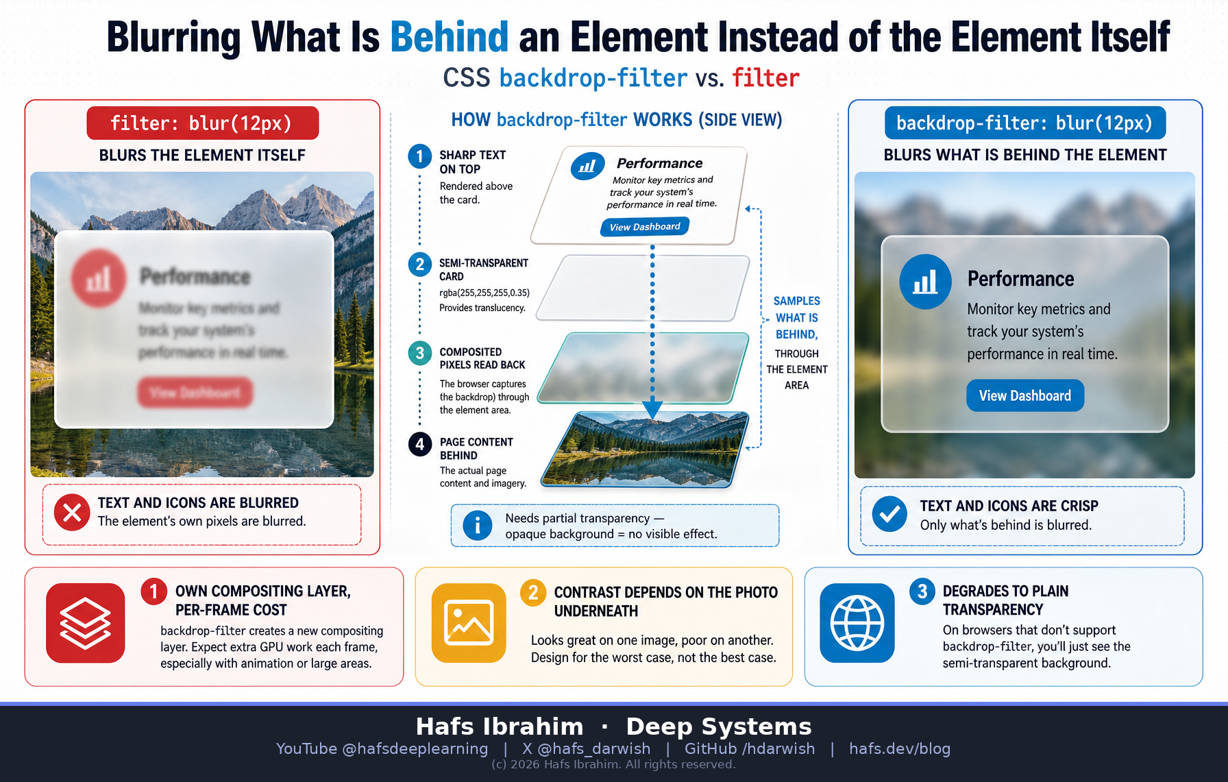
Blurring What Is Behind an Element Instead of the Element Itself
Two CSS properties, one letter of difference in intent, and only one of them can make frosted glass.
backdrop-filter vs filterCore concept
filter: blur() blurs the element you put it on — its own text, its own borders, its own children. That is almost never what you wanted, because you wanted the panel readable.
backdrop-filter: blur() blurs everything painted behind the element, sampled through the element's own area. Its text stays crisp. This is the one operation frosted glass actually requires, and there is no way to fake it with filter.
The catch: it is only visible when the element is partly transparent — you are looking through it. So the recipe is always two declarations, never one: a semi-transparent background colour plus the blur.
Key components
The subject swap
filter takes the element as its input. backdrop-filter takes the backdrop — the already-composited pixels underneath — as its input. Same blur maths, different source pixels.
Transparency is mandatory
An opaque background hides the blurred backdrop completely, and the effect appears broken. Pair it with something like rgba(255,255,255,.3) so light gets through.
Its own compositing layer
The property forces the element onto a separate layer and makes the browser read back the composited pixels beneath it. That is a genuine per-frame cost, not a one-off paint trick.
Stacking context decides "behind"
"Behind" is not "everything lower on the page." An ancestor that establishes a new stacking context changes which pixels are eligible to be sampled at all.
How it works
- The browser paints the page content that sits behind your element and composites it as normal.
- Your element, carrying
backdrop-filter, is promoted to its own compositing layer. - The compositor reads back the finished pixels in the region the element occupies — clipped to its box, its border-radius, its area.
- It runs the filter (blur, saturate, brightness…) over that snapshot, not over your element.
- The filtered backdrop is drawn, then your semi-transparent background over it, then your unblurred text and borders on top.
- Anything that moves what is behind — a scroll, a video, an animation — makes step 3 happen again, every frame.
rgba(255,255,255,.30) with backdrop-filter: blur(9px). The colour blobs behind it are soft; this sentence is sharp. Swap in filter and this sentence would be the thing that smears.
If your browser lacks support, this box degrades to plain transparency — which is exactly the fallback you must design for.
Where the pretty demos lie
The failure mode is contrast, and it is not yours to control
- Blur does not guarantee luminance. Blurring a background makes it smooth, not predictably light or dark. White text over frosted glass can pass a contrast check against one photograph and fail badly against the next — so accessibility now depends on content you do not control.
- It is the expensive one on a scrolling list. Every frame re-samples what is behind. A demo card sitting still costs almost nothing; forty of them in a scroller is a different measurement entirely.
- Unsupported means plain transparency, not "no effect". Your text lands directly on the raw image. If the fallback is not readable on its own, you shipped a broken state.
- Test the extremes, not the sample. Run it over the brightest and the darkest images in your own library, and profile a real scroll with the compositor profiler rather than trusting a static screenshot.
Real-world applications
- Sticky headers and navigation bars — the bar stays legible while page content softens as it slides underneath. The canonical honest use.
- Modal and sheet backdrops — blur the page behind a dialog to push it back visually without dimming it to black.
- Video and media overlays — control chrome over moving footage, where a solid bar would cover the picture and a transparent one would be unreadable.
- OS-style surfaces — the frosted panels in iOS, macOS and Windows chrome are this same technique; matching them in a web app is why the property exists.
- Deliberate obscuring — spoiler panels and preview paywalls that blur real content behind a readable prompt.
Checkpoint — answer before you move on
- You apply
backdrop-filter: blur(10px)to a card and absolutely nothing changes. Name the most likely single-line cause, and the fix. Hint: what has to be true before you can see through something? - Why is this property a genuine per-frame cost on a scrolling list, when a plain
box-shadowis not? Answer in terms of what the compositor has to do each frame. Hint: something has to be read back, and it changes as you scroll. - Your frosted header passes a contrast check on the marketing hero image. Explain why that result does not generalise, and describe the two tests that would actually convince you. Hint: one test is about your image library's extremes; the other is about browsers without support.